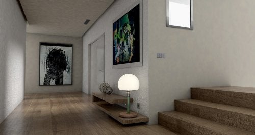
There are two closely related concepts in the paintings: identity and creativity. Now, how do you get these concepts to work perfectly and look great in a space? Find out below.
 The painting decoration is centuries old. For years, both oil paintings and photographs have been used to decorate.
With the passage of time, the spectrum of what a “painting” means has broadened and, therefore, today more interesting samples are included on the walls: watercolors, plans, technical drawings, plates or simply, poster-size prints.
Everyone has a different idea of what art is and, based on that idea, develops aesthetic concepts of what is pleasant and what is not.
For this reason, the ideas that we are about to comment on are an orientation guide not to impose any type of criteria.
When it comes to decoration, the room for improvisation and creativity must be kept wide in order to achieve wonderful results.
Before and after
In the past, paintings were used to highlight, for example, a living room sofa, a dining room table or any other piece of furniture.
It was taken as part of a background and therefore, the idea was created that the paintings were there to “fill in empty spaces on the walls.”
However, you don’t hang a frame just to fill an empty space, even though it may appear that way at first.
A painting is hung to highlight a particular piece of furniture or to give greater prominence to a specific place in a room.
In this way, a painting becomes an element that provides visual strength and gives a certain presence to an environment. It is also an expression of the personal, of what we like or attract our attention.
It is a window to both the identity and creativity of people.
Now, given its structure, a painting gives a kind of sense of order and symmetry that does not go easily unnoticed by decoration experts.
Many claim that, although there were certain rules for decorating with pictures, they can be broken.
Rules that can be broken
- Create series. Previously it was recommended to opt for the default series to have some continuity in the spaces, but today, it is not necessary to follow this rule to the letter. We can invent the series ourselves based on all kinds of criteria: color, texture, technique or even: the frame!
- Do not repeat the table. This was unthinkable in the past but it turns out that if we have two identical frames in the same space, we can play with them to create a very dynamic optical effect.
- Hang at eye level. It is said that it is a mistake to place the frames too high or too low because the eye does not go through them easily and, therefore, they are lost. However, this is almost never the case. In fact, when decorating with paintings, it is more important that they are well placed than the comfortable route that the view takes through them.
- Take care of the number of frames and proportions.
Alternatives to decorate with pictures
Instead of hanging the paintings, with their respective frame, we can give a few interesting twists to these decorative elements. It’s all about daring to experiment and get out of the default.
Next, we will give you some ideas that you can apply in a very simple way but with a great result.
- Dispense with the frame and use wash tape, paper clips, hook folders, clips, wooden rods instead.
- If the paintings are simple, with neutral or pastel tones and rather abstract, we can place them in the same space, with different frames and shapes to highlight them even more.
- Framed blank canvases are also an interesting proposal when decorating spaces, usually in a minimalist style. They propose to let the imagination fly and make the canvas whatever we want.
What else is there to keep in mind?
- Yes, different trends can be mixed in the same environment to offer variety as a Some people mix different works but keep the same color palette, while others seek to completely break the schemes and put together very different pieces. In this sense, the decision is ours.
- Mixing can help tell a story and even make ‘visual poetry’. This is the case when mixing paintings with family photographs.
- They do not always have to be hung, they can also be placed on a shelf or table. In fact, this way we can move them around more easily, which will add more dynamism to the environment.
- Placing paintings of different sizes in the same environment can create a much more interesting visual appeal than if we work only with series.
Go ahead and decorate with pictures!
The great classical painters have acquired a new prominence thanks to hipster designs. To a painting like Leonardo da Vinci’s Mona Lisa, add a short word or phrase, in modern typography, and it instantly takes on a more fun or profound air.
This is why many people do not hesitate to print and frame posters with these updated classics.
Decorating with pictures can be much more dynamic and fun than it seems. We just have to encourage ourselves to look beyond the frame and play with the multiple characteristics that paintings offer, in each of them there is a possibility that can serve as a source of inspiration.
Finally, let’s remember that even if there were rules, they can be broken with a lot of style and creativity. How will you decorate your home?
